
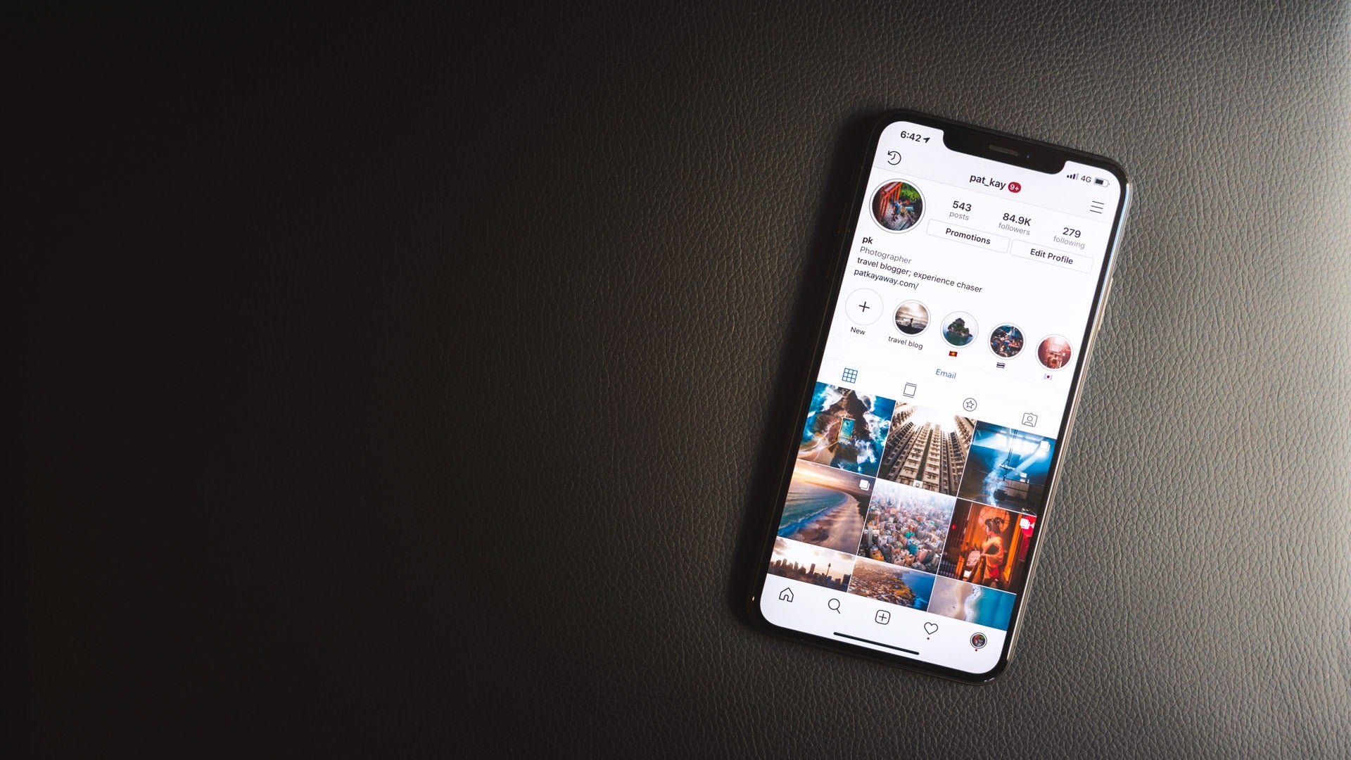
Gah! This image looks like it was shot from a potato. Pixelated, soft, full of artefacts. Gross.
…or maybe I was being too hard on myself once upon a time.
Either way, if Instagram is killing your images after you’ve spent time perfecting them in Lightroom, this article is for you. I’ll teach you the best export settings for Instagram in 2020, and if you stick around, there’s some freebies at the end.
New to Photography?
Read about the basics of Exposure and the Exposure Triangle!
So, Instagram has some recommended guidelines for images. Basically:
- Aspect ratios will be between 1.91:1 and 4:5.
- They will always be cropped to fit at 1080 pixels wide unless it’s exactly that size.
Some other things we do know, though, is that Instagram also uses what’s called an image compression algorithm on all images that get uploaded to their servers.
The compression myth
The reason why they do this is the same reason why many websites squash images too (including this website you're reading this on!) - performance. Instagram is optimising for images to load as fast as they can for the best experience, so they try and reduce the file sizes of your images so there’s less to download and thus your feeds load quicker.
Warning: this next bit gets a tad technical.
Some image compression techniques are better than others, and to be quite honest, Instagram’s is actually quite good - a decent quality for the file size. However some people find problems with it, and that’s where this article comes in.
But first, let’s dispel a myth that there’s a ‘quality’ or file size you can get to in order to avoid the compression algorithm.
I’ve seen some people say that if you set your export settings to 75% quality, or if your images are under 500kb, you’ll somehow magically bypass the compression algorithm.
That’s a total lie.
In fact, by doing so, you’re actually making your end image worse than what it could be. Here’s why.
The upload process looks a little like this:
- A user sets up and shares their image
- The image goes into the server
- The server compresses the base image
- It then makes copies of that compressed image, resizing at 150px, 240px, 320px, 480px, 640px and 1080px in what’s called a source set (srcset) so that it can show you the most relevant size of your image depending on where it’s viewed
- In the feed you usually see the 1080px wide version.
Every image is compressed. It needs to be that way because it doesn’t make logical sense to assume that the user’s compression is better than their own. There’s too many variables, and therefore the most reasonable approach is to standardise all images, even if it ends up being parity or just a check.
You can test this yourself. Upload an image at 50% quality at less than 500kb and extract that image from the desktop version of Instagram (right click > inspect element on your image > expand the sibling DIV > right click to open your image in a new tab > save) and compare it to your original image. The actual quality of the algorithm is quite good - compressing file size considerably at little loss of quality - so it’ll be hard to tell, but there’s definitely compression there.
Therefore, if you’re uploading at 75% quality, then you’re compressing 75% quality. Alternatively, if you upload at 100%, you also compress at 100%.
The best export settings for Instagram in Lightroom
With that said, there are 6 dimensions to consider when exporting for Instagram.
Sharpening
This is actually the biggest deal when it comes to what looks like a high quality image.
Sharpness is usually perceived as detail, and a more detailed image looks better generally.
As with all formats, whether it’s print or digital, you need to sharpen for your medium. Typically, you’ll have different sharpening levels if you’re getting your image printed vs being viewed on a mobile device. This is because depending on what medium you’re viewing the image on, there are variables in the quality of your viewing experience.
How many pixels per inch does your phone pack into its display? How many dots per inch is your printer printing your image at? What material and size? What about the size of your display? How far are they standing away from the image? What size is it seen at? All of these variables and many more determine how good your image looks when someone is viewing it.
That’s a long-winded way to say that you need to sharpen for a phone display. And although you can do that by setting your “Output sharpening” to “Screen”, we can do better.
Check out this article on how to sharpen images in Lightroom. The juicy part is at number 5. TLDR; use masking.
Once you’ve sharpened your shot, send it to your phone. If it looks like it’s almost too sharp, you’re golden. The compression will dull it down when you upload it.
Crop
While Instagram supports every ratio between 1.91:1 and 4:5, there’s only really one crop size you should be uploading at - 4:5.
4:5 turns out to be the largest pixel size you can upload. It not only gives you the most digital real estate to work with in your photo, but it also takes up the most size in the feed.
Due to the nature of their aspect ratio in the portrait orientation of a phone, when your audience scrolls through their feeds, unfortunately the landscape images - the little images - get skipped over pretty fast.
Square images are better, but 4:5 images are the best.
(For the record, I prefer to shoot and showcase my work in landscape mostly, but eh, you gotta change with the times!)

Quality
If you missed it, read the previous section on “The compression myth”, but this section is otherwise pretty straight forward.
Best quality. No limit. JPEG or PNG. Size be dammed. That’s what the image compression algorithm is for. It’s going to be compressed regardless of what you do.
Colour space
There are a few choices for what colour space you can export to. Many printers prefer their files in AdobeRGB (1998) because the colour space is wide and varied enough for the subtle changes in tonality, while matching with what most physical printers print at.
For digital, we’re looking for sRGB. The majority of digital is sRGB - that’s what you should be editing with and that’s what you should be exporting at for the most consistent experience. Now, what I mean by "consistent" is that there are many devices today that support the P3 colour gamut (and even the Instagram app itself does). However, that's not to say that all devices showing Instagram show that. So when a P3 image tries to show itself on an sRGB gamut device, because it's wider than the sRGB gamut, gets smushed and colours get compressed. It's unavoidable, but even worse than that, uncontrollable; you don't get a choice in the matter.
Therefore, the best solution here is to edit and output in sRGB, this is the safest approach to make sure your image looks as consistent as possible on all devices.
Image sizing
Instagram always displays images at 1080px. In their guidelines, they say that they skip the resizing process if your uploaded image is equal to or less than that resolution.
There’s two approaches here:
1) Export at 1080px wide. That means:
- Square: 1080px x 1080px
- 4:5: 1080px x 1350px
2) Export at exactly double 1080px wide.
One of the reasons why I do this is because if Instagram wants to increase the displayed image sizes in the future, they have a 2x version of my image that they can re-splice a source set from.
But the main reason is that exactly 2x or 4x resized downwards will always be kind and safe to whatever resizing work is going on in the background. In some cases, it’s even sharper (for example: cameras downsampling from 6k to 4k for a superior, sharper image like in the Sony A6500).
- Square: 2160px x 2160px
- 4:5: 2160px x 2700px
Again, it's a safe option, vs having the resize algorithm squish and strangely resize your image to something that doesn't look great.
When it comes to resolution, DPI/PPI doesn't matter for digital. It has absolutely no visual effect whether this setting is at 0 or 300. In the digital world, a pixel is a pixel. In the print world where these values actually do matter, a digital pixel can manifest itself as different physical sizes depending on the technique of the printer and the print machine itself.
For our use case, let's just leave it as the default, 72.
Meta
Instagram strips all your metadata. Up to you if you want to export any out, but by the time you upload it, it’s gone and it never comes back.
Recommendations for exporting in Lightroom
Okay, time to put it all together!
- Sharpen your image first before exporting
- Use a 4:5 crop
- Image format: JPEG
- Quality: 100
- Color space: sRGB
- No limit on file size
- Resize to fit: Width & Height, Don't enlarge, W = 2160px H = blank
- Resolution: default, 72 pixels per inch
- Output sharpening: Sharpen for Screen, Standard
Enjoy! I'm sure your images will look absolutely fantastic quality after this.