Achieving balance in photography is one of those things that’s easy to learn, but tough to master.
It’s also one of those things that makes a huge difference in your images, and you can start to make small changes straight away.
Balancing your images really helps the “first impression” or the “initial understanding” of an image. It answers some key questions: Does your viewer understand what your image is about straight away? Or is there a level of decryption that needs to take place? How approachable is your image and how approachable do you want it to be?
Whether you decide that your image is balanced and initially pleasing to the eye, or its imbalanced and one that creates tension that needs to be resolved by the viewer, a good way to start to make intentional choices about balance is to consider it in three ways: Positional balance, Colour balance, and Tonal balance.
Positional balance in photography
This is probably the most approachable and understandable of the lot. It’s also the one that makes the biggest difference to your compositions.
Positional balance refers to how your objects are laid out in your scene. When we make images, we’re making intentional choices about where our objects and subjects are in space and what priority they assume in their context. This provides the viewer with a visual hierarchy of what’s important in your image.
There are many methods for positional balancing in photography. Some involve placing subjects or objects on imaginary grids (the rule of thirds), some on imaginary swirly lines (the golden ratio). Some use environmental “lines” to guide the viewers eye a particular way, and some use competing objects juxtaposed against one other.
While there’s a ton of different ways to go about this - and experience you gain in photography, the more techniques you’ll learn - the power of positional balance is one of the greatest differentiators between “good” and “bad” photography.
Here’s a few things to keep in mind:

Rule of thirds
You’ve probably heard of the “rule of thirds”. It’s a visualisation hack that has you split your image into an imaginary 9 sections using 4 lines, like a tic-tac-toe board. Placing subjects and objects on these lines makes this a great compositional hack that gives you an easy method to balance or unbalance your image (through harmony or through tension).
Symmetry
Visually, symmetrical layouts are very immediately understandable and thus very pleasing to the eye. The brain doesn’t have to do a lot of work to figure out what’s going on in a symmetrical scene because the visual weight is even.
These types of images have a natural balance to them, and although you’ll rarely find a perfectly symmetrical scene in real life, images of reflections and half/half compositions are an easy way to approach symmetry in photography.
Asymmetry
Positioning subjects or objects in an asymmetrical fashion creates tension in an image.
The brain takes a fraction longer to understand an asymmetrical image, even if it’s a relatively simple one. Asymmetric images generally incorporate subjects and objects on off-centre points, away from the middle of the frame, and can sometimes cause an image to seem more “dynamic” because techniques such as negative space or leading lines can suggest a particular narrative to the viewer.
These types of images can seem more interesting after they’re understood by the viewer, as the viewer would have gone through some level of decoding the suggestion or meaning within the image, and that “ah-ha!” moment would be in itself their “reward”.
This takes place in the viewers minds consciously or subconsciously, but ultimately we all go through some level of decoding when viewing an image.

Object juxtaposition
This one is a little more tactical than the last 2 abstract concepts.
Placing complementary or opposing objects in your image can provide a balance to the overall composition, even in a symmetrical or asymmetrical fashion.
An easy way to think about this is the concept of “opposing visual weight” - of one object compared to another. We see this all the time in street photography: A small silhouette of a man walking against a wall, his large shadow cast behind him. A small figure of a person looking at a tall building. The slim silhouette of a person walking across the street, a traffic jam of headlights from the larger cars behind them.
In landscape photography too: A tiny person in an epically huge landscape. A small car against a big road. A small foreground detail on a beach vs the huge mountain behind it.
This opposing visual weight and its resulting contrast (in the literal sense, not the tonal sense), creates an imbalance that results in tension and interest.
Colour balance in photography
Colour too, has balance.
What colours you decide to show in your image has a big effect on whether or not the image seems harmonious.
There are a few methods to creating a harmonious colour palette in your image, but the three most common are: Complementary, Analogous, and Monochromatic, and each have their own benefits.

Complementary
This is easiest to understand if you just jump on the Explore page on Instagram for a few minutes and start to see all the orange and teal images everywhere.
Orange and teal is a great example of two colours that complement each other. There’s a harmony between these two, as they’re located on opposite ends of the colour wheel, and our eyes are immediately comfortable with this combination of colour. Try to look for complementary colours out in the field, as they usually contribute to a pleasing image.
Some other noteworthy complementary combos are: Blue and Yellow and Green and Red.

Analogous
This is easiest to understand if you’ve ever seen an explosive sunrise or sunset.
The sky turns pink and purple, with bursts of orange and yellows. All these colours are next to each other in the colour wheel and provide probably the most immediately understandable palette of colour. In this example, it’s immediately understandable that an image like a sunrise or a sunset is a “warm” image, and because of that, we feel a harmony when viewing such an image.
Other examples in nature might be the green, yellow, orange and red hues of a volcano and its lush surroundings. Or the blue, teal, and green combination of the ocean.

Monochromatic
A monochromatic image is simply one that contains a single value or a set of shades of the same hue.
Usually this has the effect of drawing your viewers attention to the objects in the composition itself, and detracting from what the colour actually is - sometimes it doesn’t even matter.
The inverse effect is also useful too, if you are including a strong subject, removing the surrounding colours may be a great technique to draw even more attention to your given subject, creating a positive imbalance with a creative purpose.
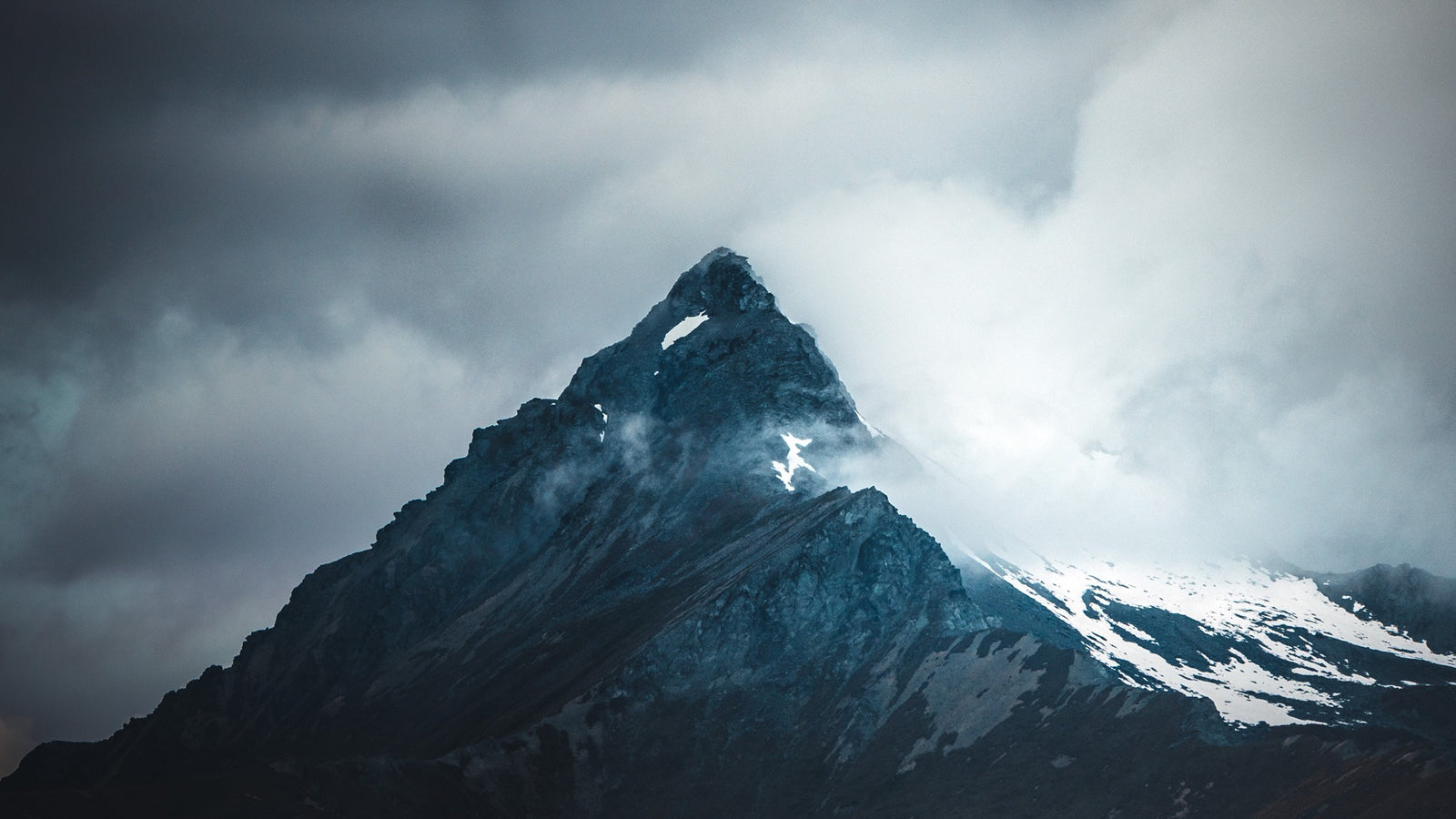
Tonal balance in photography
The third concept to help you understand balance in photography is tonal balance. Specifically referring to the brightness (and darkness) and luminosity of an image.
Having light portions and dark portions of your image help provide shape and depth to your image, accentuating (or removing) the contrast between objects and subjects.
This contrast can help create imbalances in your image that help define the elements within your scene.

For example, in this image, the silhouette of the Opera House is the subject of this image. The silhouette is created by the tonal contrast of light and dark, it’s own shadow vs the sun behind it. This gives the Opera House an immediate sense of subject and place.
However, in the example on the right, flattening out the contrast where the Opera House is no longer in shadow, and the sun is no longer as bright, the flatness of the image removes the contrast between the two objects. While both are still tonally balanced (high contrast vs low contrast), the left version can be perceived to have more dynamism and energy and is more easily understood.
But of course, there’s so much more
But with these three concepts: Positional balance, Colour balance and Tonal balance, you can get very far with your photography and you’ll find over time that you start to prefer some balance techniques over others, and that’s when you start developing a “style” as a photographer.
Happy shooting.