Knowing the right Instagram crop sizes can make a big difference to how your content looks on the platform.
Depending on your goals, you might be interested in posting with different Instagram crop sizes, or you might even be looking for the reason why most people use the 4:5 crop ratio for their images.
Here’s a quick cheatsheet of the the Instagram crop sizes for posts, stories and IGTV in 2020.
Related Instagram goodness
The best export settings for Instagram
How to grow your Instagram in 2020
-
Instagram crop sizes - Posts
-

(1080x1350px)
4:5 ratio (Highly recommended)
This portrait orientation isn’t just used for tall images and actual portraits. Use it for landscapes and everything in between, too!
I recommend you post in 4:5 for just about everything. Sure, it means you might have to make some concessions with your compositions. Or maybe it forces you to think ahead when you shoot. However, in this mobile age where everyone scrolls fast, you have just seconds to impress, and more real estate = more time.
Use it because
- It takes up the most screen real estate when scrolling
- The size allows for the biggest visual impact
- It feels natural when viewing on a mobile device
-

(1080x1080px)
1:1 ratio
Sometimes, you need a little bit more horizontal space for your images, I get it.
Although I’d still recommend you try to squeeze your compositions into a 4:5 crop ratio for Instagram, for some images you just can’t get away with it.
Use it because
- Square images still perform well generally, although not as well as 4:5
- You need the extra space to complete your composition and a portrait crop just won't do
- You’re trying to avoid a landscape crop size
-

(Don’t go there)
Any landscape crop ratio
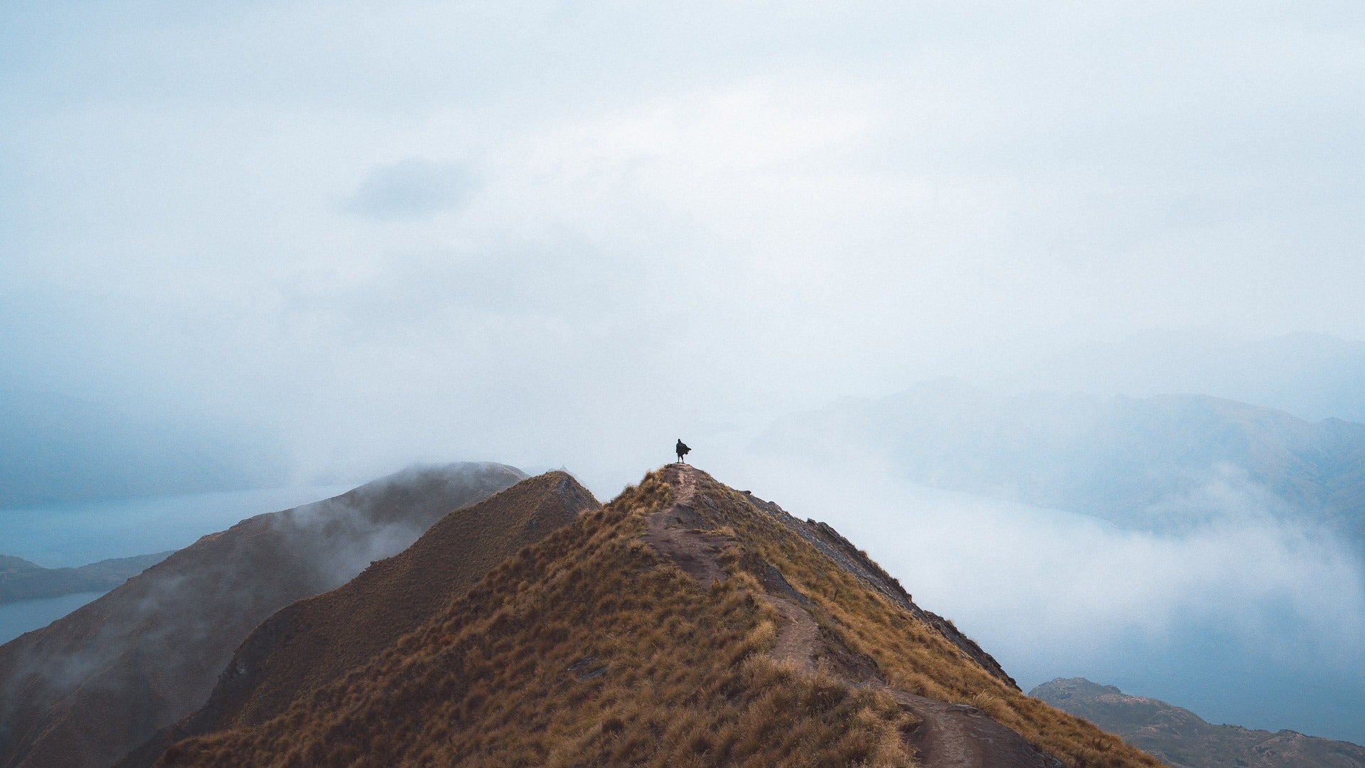
Instagram allows for a landscape crop ratio down to 1.91:1, but I would highly, strongly, recommend against posting with this crop.
Although I understand there’s an artistic vision to be fulfilled sometimes, the truth is that landscape images don’t get the same amount of screen time as 4:5 or 1:1.
In fact, landscape images perform worse the tighter the vertical space becomes.
Don’t let this be you - posting content that’s native to the consumption of the platform is one of the most important things about marketing your art. On Instagram, that’s visual impact on a mobile device - use 4:5.
Use it because
- Well, don’t.
- ...unless you don’t care about engagement (in which case, more power to you. Do what you like.)
-

(1080x1920px)
Instagram Stories
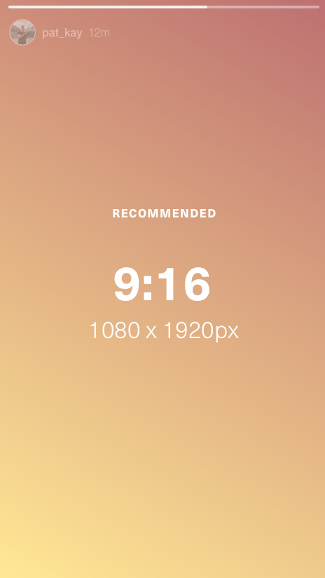
Stories are very simple when it comes to Instagram crop sizing - create content that’s 9:16, and fill as much of the screen as possible, even if Instagram allows you to go all the way down to 1.91:1, much like it does with posts.
Instagram will always try to display this sizing on the most amount of devices, but seeing as how we’re in this crazy age of funky mobile device ratios (I’m looking at you, Samsung), sometimes the left and right edges of stories get cut off because the devices are too tall.
Keep that in mind, and make sure you keep an invisible “safety zone” on the left and right of your Instagram stories.
-

(1080x1920px)
IGTV
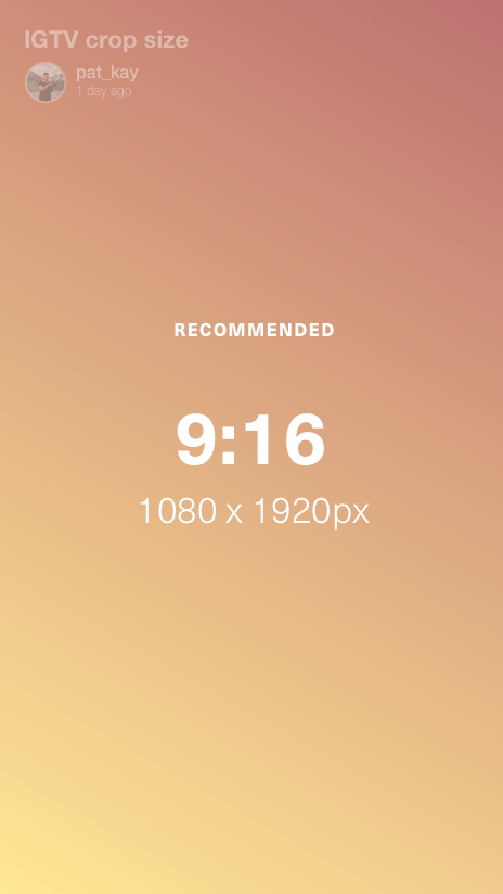
…these crop sizes are a bit all over the place.
They get resized and reshaped quite a bit because a single video can appear in so many locations.
Generally on full view, videos appear in 9:16, but they can also appear as 4:5 when they’re shared to the feed, and can also appear as 1:1 on the explore page.
As a general rule of thumb, try to keep your main focus area in the centre, giving yourself an invisible 1:1 safety margin for when Instagram auto-crops your video content.


0 comments