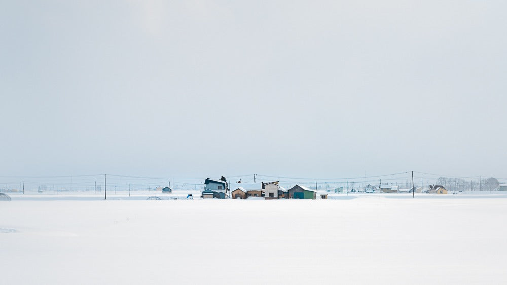
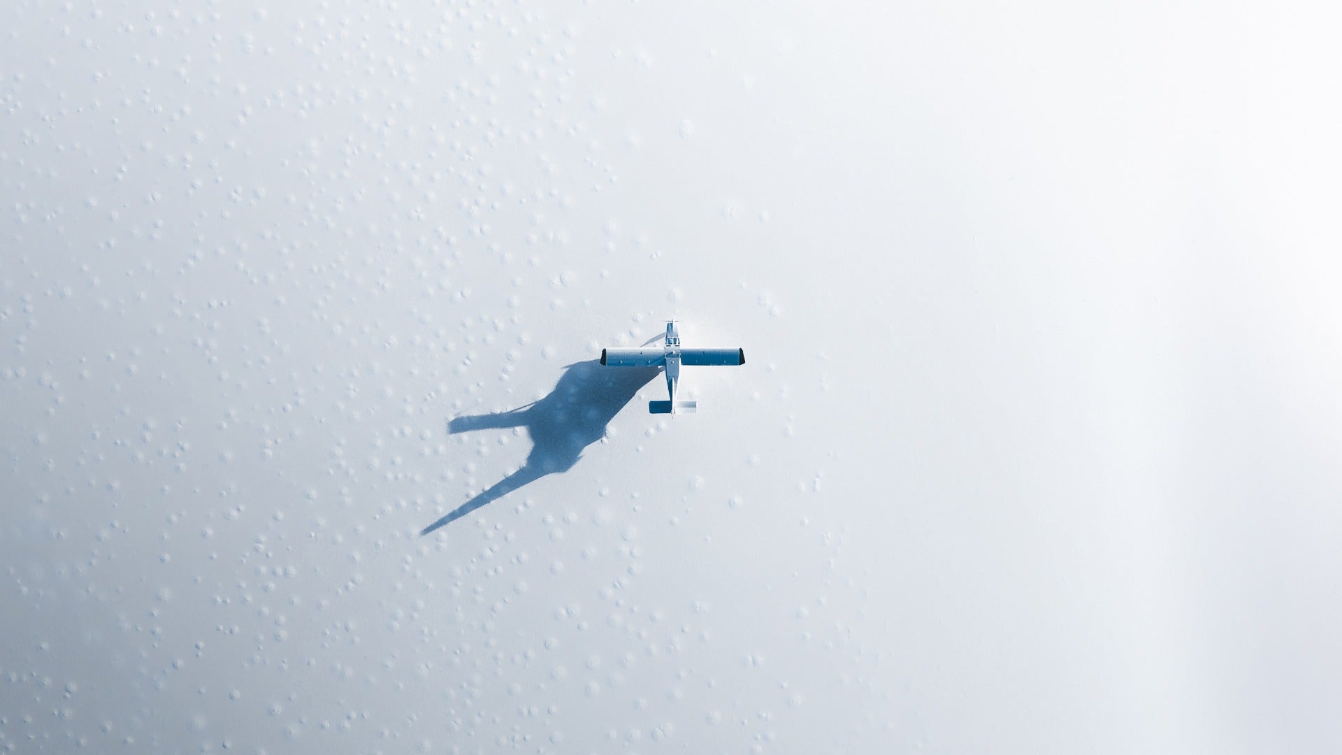
Negative space in Photography (and positive space) is one of the most effective visual language techniques any photographer can learn.
As a component of Visual Language, we see it used commonly in other visual mediums such as painting, architecture, illustrations, cinematography and more.
Negative space in Photography is a tool that allows photographers to accentuate their subjects in a more visually compelling way. It’s about subject isolation, and it’s one of my favourite techniques to use.
What is Negative Space in Photography?
Well, let’s start with positive space first because that might be a little easier to understand.
Positive space
Positive space in Photography is about the subject. It’s about where your eyes should be looking as a viewer, and it’s about the photographer’s deliberate inclusion of specific subjects that enables that.
Often, you’ll hear this talked about in terms of “story”, the main point of an image, or the main idea being communicated; a portrait of a baby, a landscape of a grand valley, the gate of someone’s stride as they cross the street.
It’s the thing that’s easy to identify the image with.
Negative space
Negative space, on the other hand, is a little more abstract.
Rather than it being about where your eyes should be looking at as the viewer, it’s about the enablement of that movement. It’s about providing the surrounding environment for the positive space to sit in, and it allows the subject or the main idea of the photograph space to breathe and express itself.
It’s the suggestion that there are certain parts of the image that are more important than the others.
Most importantly, it’s about the idea that every image has a “hierarchy of importance”; a specific order in which the viewer should be digesting the composition.
Effective photographers are great at communicating to the viewer what that order should be so they can tell their story in the most compelling way possible.
Negative space in Photography is essential. In many cases, I’d go so far as to say that a subject is only as strong as the negative space that surrounds it.

Simplification
Generally speaking, in Photography, the easier a photo is to immediately understand to a viewer, the more powerful, evocative, or successful that image is.
It’s a lot like writing; when writing a paragraph, there’s most likely going to be one or at most two main messages before each final full stop.
However, sentences can become verbose; a lot of extra fat, too many words, or superfluous ideas that don’t serve a purpose. And suddenly what could have been told in 3 sentences bloats out to 13.
Photography is a lot like that.
The more effective you are at getting straight to the point (even if that point is to intentionally force people not to get to the point immediately - yeah, I’m getting real meta here), the more effective you’ll be as a visual communicator.
To borrow from Minimalism
An idea I think is terrific to borrow for both positive and negative space in Photography is Minimalism.
There’s a common misconception that Minimalism is about throwing things out. About not having stuff. About being unencumbered and free and whatever.
But to stop there is to look at the words without understanding the meaning behind the passage.
See, Minimalism isn’t really about throwing out stuff. It’s about intentionally deciding what things to include into your life.
Thoughtful selection, rather than unintentional addition or reckless subtraction.
As photographers, we should seek to be more thoughtful about the things we decide to include in our images, what subjects we use (our positive space), how we shape them (our negative space), and how our stories get told.
We’ll have better images as a result.
Examples of Positive and Negative space in Photography
Being deliberate about how we use positive and negative space in Photography can enable us to clarify our images in any setting:

Vastness - We can use it to illustrate an idea of vastness through the inclusion of a lot more negative space than positive.

Subject isolation - We can use it to isolate our subjects and focus attention on the things that matter.

Calm down compositions - We can use it to calm down chaos and bring order and sense into compositions.
And so many other ways; your imagination is the limit.
tl;dr
Positive and Negative space in Photography is about the idea of being intentional with not only our subjects (positive space) but about the context and environment that surrounds them (negative space).
In many cases, it’s easy to think about this in terms of what the eye sees as a viewer of an image; the positive space is where you want the viewer's eyes to go, the negative space is the path the eyes take to get there.
Both are extremely important, as effective use of positive and negative space in Photography suggests a hierarchy of visual importance and thus provides clarity and conciseness to an image.
As a bonus, we can take learnings from Minimalism and the idea that the intentional, deliberate inclusion of elements is far more critical than removal of elements, or the subconscious addition of everything in our compositions.


0 comments